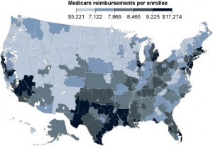
Witness this map.
It’s called the Dartmouth map, and as the New York Times and Hot Air notes, it was used by the Obama administration to argue that there were existing inefficiencies in the Medicare system that could be trimmed away, thus permitting a scenario where Medicare funding could be cut significantly while not sacrificing care (indeed, the map’s creators argue that it demonstrates that cutting Medicare will improve care). In fact, Sir Donald – that being the guy who loves the British Health Service to, ahem, death – is particularly enamored of this map:
Dr. Donald Berwick, nominated by President Obama to run Medicare, called it the most important research of its kind in the last quarter-century. In March, in response to the Congressional Democrats who would have otherwise withheld their support for the health legislation, the administration made a promise. It said it would ask the Institute of Medicine, a nongovernment advisory group, to consider ways of putting the Dartmouth findings into action by setting payment rates that would punish inefficient hospitals and reward efficient ones.
Just one small problem: it’s not actually a map of inefficient care. Just expensive care. More from the Times:
…while the research compiled in the Dartmouth Atlas of Health Care has been widely interpreted as showing the country’s best and worst care, the Dartmouth researchers themselves acknowledged in interviews that in fact it mainly shows the varying costs of care in the government’s Medicare program. Measures of the quality of care are not part of the formula.
For all anyone knows, patients could be dying in far greater numbers in hospitals in the beige regions than hospitals in the brown ones, and Dartmouth’s maps would not pick up that difference. As any shopper knows, cheaper does not always mean better.
To put it in non-medical terms: this is roughly equivalent to declaring that buying real estate in Des Moines is automatically more efficient than buying real estate in Bethesda because the average cost per square foot of the former is much lower. Which could very well be, in certain circumstances; and it can certainly be argued that reducing waste would not decrease the quality of care. Where the dispute is in whether cutting costs in expensive Medicare areas would be actual waste reduction… and whether those reductions would improve health care. The Times, one more time:
In other words, there is little evidence to support the widely held view, shaped by the Dartmouth researchers, that the nation’s best hospitals tend to be among the least expensive.
But it’s a really cool map. Want to see it again?
…and that’s how we determine public health policy in this administration!
Moe Lane


If I had the raw data I’d remake this map with a cost of living adjustment.
This reminds of something that happened at least 20 years ago. Some professor at Harvard Medical School, with a letterhead declaring himself the “Physician’s Project on Hunger in America,” published a map of “the hungriest counties in America.” Got tons of publicity, spurred passage of Federal legislation, the whole nine years.
But then the “hungriest counties” began to report that they couldn’t find any hungry residents. It turned out that the map was based on how much people spent on food, not on how much food they had. The “hungriest counties” were in fact very rural counties, where people grew or hunted food instead of buying it.
My comment at the time was, “Only a Harvard professor wouldn’t know that food grows on farms.”
(bama-Speak the fusion of Sophistry and Newspeak. Some see it as a gift, most see it for what it is, just lies.