
I say “threatened” because if the NY state legislature doesn’t come to a deal by Wednesday, this is the map that is very likely going to be the one to get used:


…and there’s going to be several Members of Congress who will be very unhappy if that happens. Including Steve Israel of the DCCC.
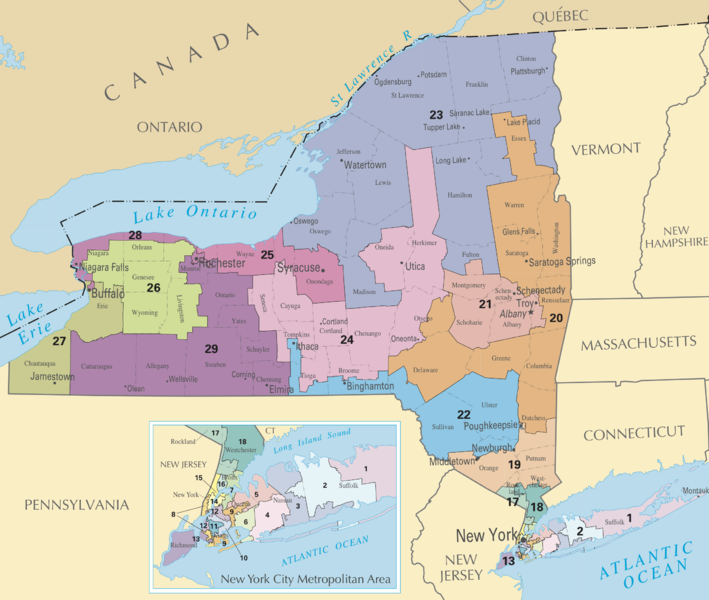
Compare this map to the current one and the first thing that leaps out: the districts are a lot more straightforward, especially outside of NYC. That should be the first indication that the lines weren’t actually drawn by politicians, of course. As to the most obvious details: Representatives Hochul, Buerkle, and Turner will be playing the parts of Major Sacrificial Lambs (Turner has reportedly already decided to run for the US Senate instead). But there’s more subtle stuff going on below the surface; for example, as David Nir of dKos* noted but did not address, Charlie Rangel now has a Latino-majority seat. Frankly, that probably means that Rangel is on his last, or second to last, term. There’s little flourishes like this, scattered throughout the map; it, in fact, comes across as being somewhat hostile to New York politicians in general. Given that it was created because the state legislature is too busy fighting both itself and the governor over redistricting, this should hardly be surprising.
Moving along… below are a list of the incumbents that I think are most in trouble with this map. The data comes from Red Racing Horses (H/T: @CTIronman):

This chart needs a little explanation: ‘BO’ & ‘JM’ represent the popular vote totals for Barack Obama & John McCain in 2008; and ‘Dem’ & ‘GOP’ are likewise the partisan numbers. ‘Bush’ & ‘Lazio’ ask if either candidate won that area in the 2004 and 2000 elections, respectively. Green represents a candidate whose district went for both the opposite Presidential/Senatorial candidates in 2000 & 2004; yellow represents a candidate where the new district went for one, but not the other. So, looking at those numbers… pretty much explains why people consider Bishop, Buerkle, Owens, and Horchul at considerable risk: they’re now in districts that are historically hostile to their parties. And that’s also why people aren’t talking so much about Hayworth or the rest of the freshmen Republicans; 2008 may have been bad for the GOP in NY (and more or less everywhere else), but the historical numbers are good and they are, after all, incumbents.
Finishing this up: note that the above numbers represent voting percentages as they would have occurred if the districts had existed in that form back then. To give an example: current DCCC Chair Steve Israel is currently in NY-02, which went for 56/43 Obama/McCain and 53/45 for Kerry/Bush. He will be running in NY-03, which would have gone 54/46 Obama/McCain and 52/48 Kerry/Bush. Which is why he’s on the list above, actually (Lazio won what would later be NY-03 in 2004)… and why this entire map is a not-very-subtle hint to the legislature that they have run out the clock on this particular game.
Moe Lane (crosspost)
*Gimme a break, it was a decent if admittedly Democratic-partisan analysis.
Does that judge by any chance have some free time?
I would love to have him/her come to Texas and offer courses in how it’s done. Come to think, there are probably a lot of States that could use him/her to profitable advantage.