
This is the rock that the Obama administration’s ship of state is going to founder on:
(Data via the Bureau of Labor Statistics.)
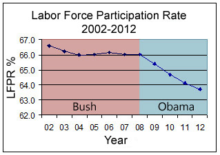
The graph shows the labor force participation rate for the last four years. The short version is that the LFP rate shows the percentage of the population that could be working that is actually working. And as you can see, that number was remarkably stable under Bush’s term. The rate more or less stayed around 66% from calendar year 2002 to 2008… and it dropped significantly in calendar year 2009. Now, some people would argue that this is not Obama’s fault… just like they would argue that it was not Obama’s fault that the rate dropped equally significantly in calendar year 2010, and dropped equally significantly in calendar year 2011, and dropped equally significantly in calendar year 2012 (that year’s average was 63.7%). The LFP rate for December 2012 itself was 63.6%, which as CNS helpfully notes is significant, in its way: “the labor force participation rate had not been as low as 63.6 percent since 1981, the year President Ronald Reagan took over from President Jimmy Carter.”
So, basically, based on this detail and others we seem to have all signed up for a grand thought experiment: What would have happened to the USA in 1981 if Jimmy Carter had actually won reelection? The bad news is, we can’t actually opt out of said grand thought experiment. The good news is that the system really is designed to survive the occasional fumbled-fingered idiot running it. If we managed to make it through James Buchanan and Woodrow Wilson, we’ll make it through this.
Moe Lane (crosspost)
PS: I understand that the Left absolutely hates it when it’s pointed out that we’ve been steadily losing workers to despondency for the last four years. Bless their hearts, but can you blame them for trying to push back on this inconvenient truth? – The ironic bit is, of course, that progressives should be the ones screaming the loudest at Obama to get the real unemployment rate back down. You can’t run all of those government programs without tax money; and nobody smart actually thinks that you can get it all off of the ‘rich’…
The key phrase there is, of course, “nobody smart”.
Don’t blame me I’ve had jobs sure they were temp jobs but when your on disability for a wrecked knee you take what you can get. Beggars can’t be choosers.
Once we get some semblance of competence regarding the economy in the White House, we’re probably going to need job training programs for all the people that have been out of the work force for multiple years.
I’ll just lay a marker down here, Finrod, and suggest that any Conservative and/or Tea Partier who thinks this sucks and who can spend a couple hours *teaching* a job training class – throwing in some conservative principles along the way – had best apply for the position.
.
If we really wanna change this, we need to change the way people *think*. (or, less charitably, the fact that people *don’t* think…)
.
Mew
Little Buck was only President for four years, tho’…and we got a whole Civil War out of that one…
This … is ugly.
.
At some point, the camel’s back will break, and yet we’re adding straws by the truckload…
.
I suppose I should be optimistic because birth rates would average this out .. but that’s only true if boomers die faster than they’re estimated to .. and if the Millenials join the system like the Gen-X and Gen-Y folks did and sorta did… and right now the Millenials seem to be opting out.
.
Mew
And who can blame the Millenials? The ones I know pretty universally want all members of all three branches of government burned at the stake. And I no longer care if they manage to make it happen.