My wife suggested that I do an offset of the image, this time, because of the nature of the picture. What do you folks think? I could go with both.

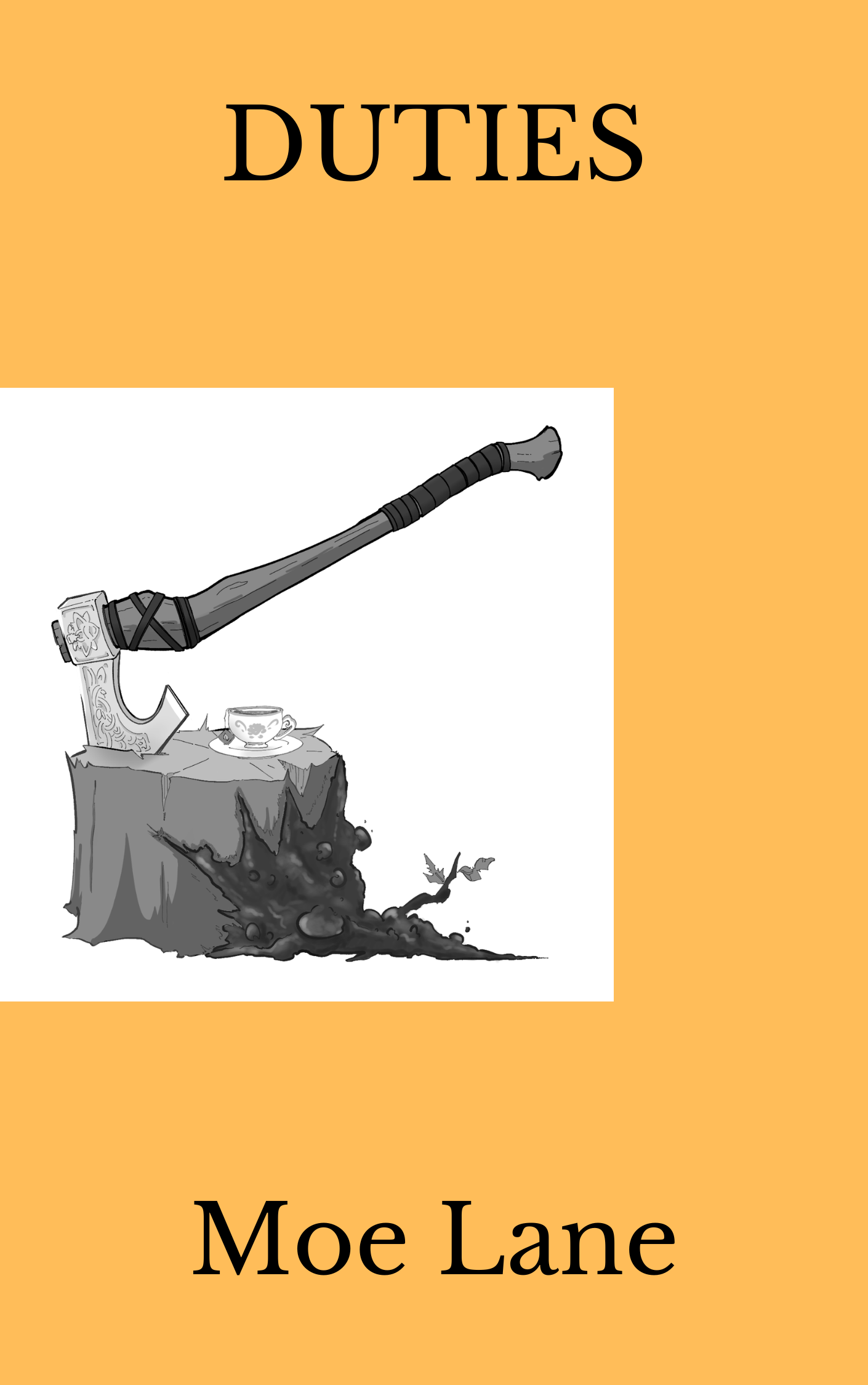
UPDATE: She was thinking of something like this:
Which, admittedly, is a good deal better than what I thought she meant originally. Look, I just bang on the clicky-things until the words come out of the magic thought-box.
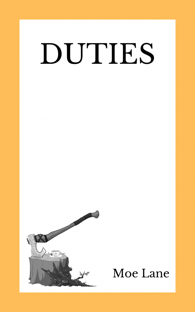
Does the offset in any way prevent the image from not extending to the binding in a printed copy? That would be my only concern for the open-sided edition in a printed format, and wouldn’t apply to digital format.
Personally, I preffer the symetry of the centered image, as much as I hate to disagree with the typically-on-point Mrs. Lane.
Neither my Android nor Firefox (or at least my iterations of them ) will load the pics for viewing – – but they will open them in new tabs for viewing.
So that’s weird.
Following up on Jon, if the Offset would extend to the binding and have the title printed down the color contrast as such:
D
U
T
I
E
S
That would like nice
Just looking at those two I’d say centered, but I recognize that it might look a bit different on an actual book.
I’d also suggest… possibly bring the picture down a bit, to the point where the author name has as much margin above and below it, and then bring the title down to where it has the same amount of margin space above and below *it*.
There’s just something in the current margins that look awkward. The title in particular is simply too high up for a title that’s not deliberately getting out of the way of anything.
While I took a nap, my wife came down and gently drew some stuff so I would understand what she *really* meant. Sorry! 🙂
Oh thank goodness. The one she did is quite nice, actually. 🙂 In truth, my personal taste still says fig.1 though.
Oh, that last one is quite nice.
She does have the eye. I don’t, personally, at least not by the standards of my family. One reason why I specialized in the written word instead of the visual arts. 🙂
Version the third is clearly the best.
I prefer number two. Three might work if the axe was a little bigger, but there’s too much empty space in the middle of that thing for me.
Option 3 has my vote, now that it’s out there.