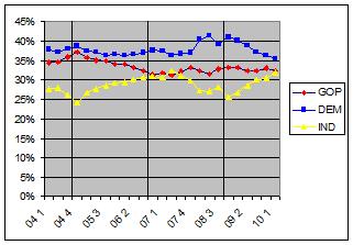
I had read the latest Rasmussen examination on the topic (short version: health care debate increased both the GOP and Democrats’ partisan identification) when I noticed that they had provided a handy table of their polling results over time. I personally feel that this material is more accessible in graph form; so I pulled the results, averaged them by quarter, and graphed the whole thing out. So:
The vertical bars represent the last three federal elections. Using somewhat primitive analysis methods (‘squinting and looking’) 2005-2006 seems to show that Independent voters increased at the cost of Republican ones; and 2007-2008 seems to show Democratic voters increased at the cost of Independent ones. And since then… Republican voters are more or less holding steady, while Democratic voters are dropping at about the same rate that Independent ones are growing. Continue reading Unpacking the Rasmussen partisan numbers.

