Thirded. The second image is too busy. Plus, a snake-man wearing an Indiana-Jones-style outfit is a better attention catcher than the more generic couple in the second image.
(BTW, I only just connected Alkali’s race to Indiana Jones’ dislike of snakes. “Snakes… why did it have to be snakes?”)


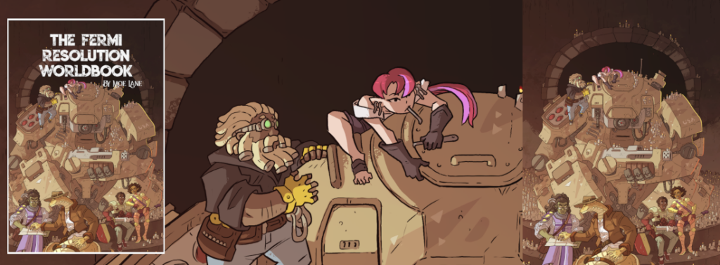
I’d vote A. Nice large readable header, good secondary focus on the characters on the left.
(Also, love the artwork – kudos to the artist!)
Seconded.
B is beautiful but *not* readable on a cellphone.
Go with A.
Mew
Thirded. The second image is too busy. Plus, a snake-man wearing an Indiana-Jones-style outfit is a better attention catcher than the more generic couple in the second image.
(BTW, I only just connected Alkali’s race to Indiana Jones’ dislike of snakes. “Snakes… why did it have to be snakes?”)
For once i won’t be needlessly contrarian, A is better
Top, definitely.
I prefer the top one. The bottom one is too busy and confined with that box on the side. The top one suggests openness and room to explore.
Yeah, there’s a consensus here.