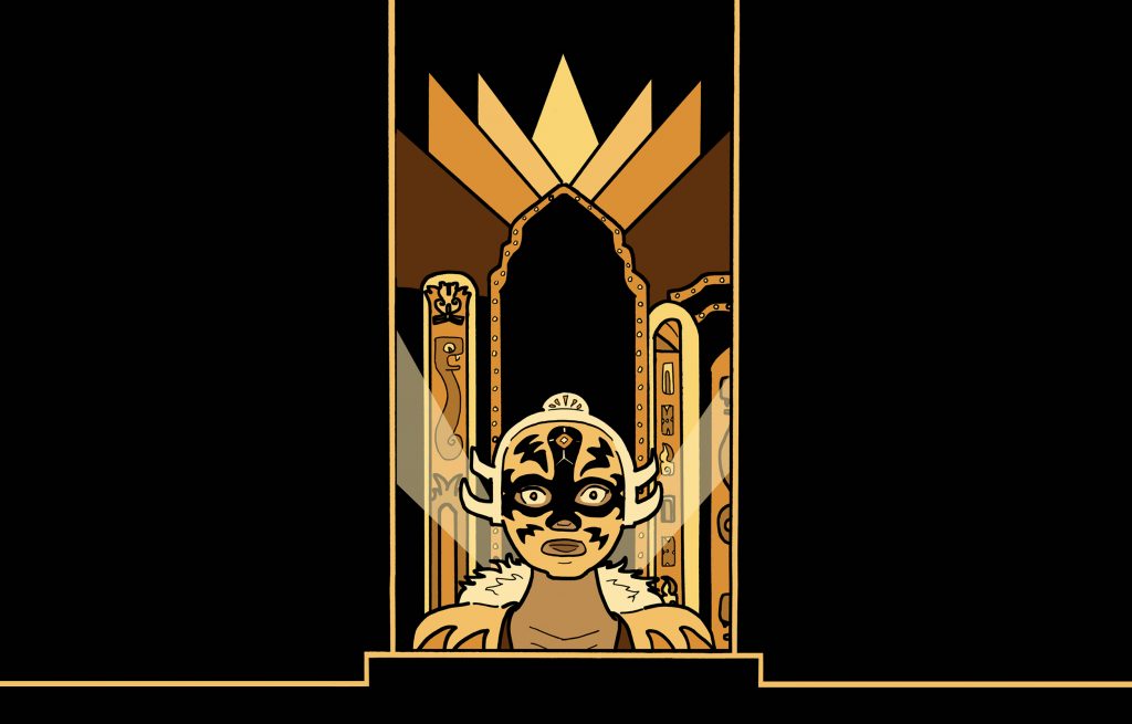
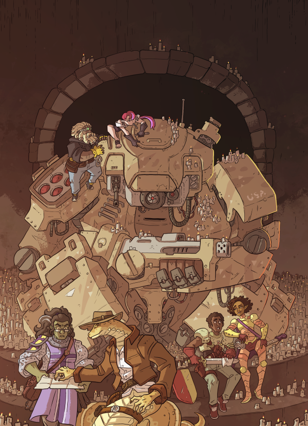
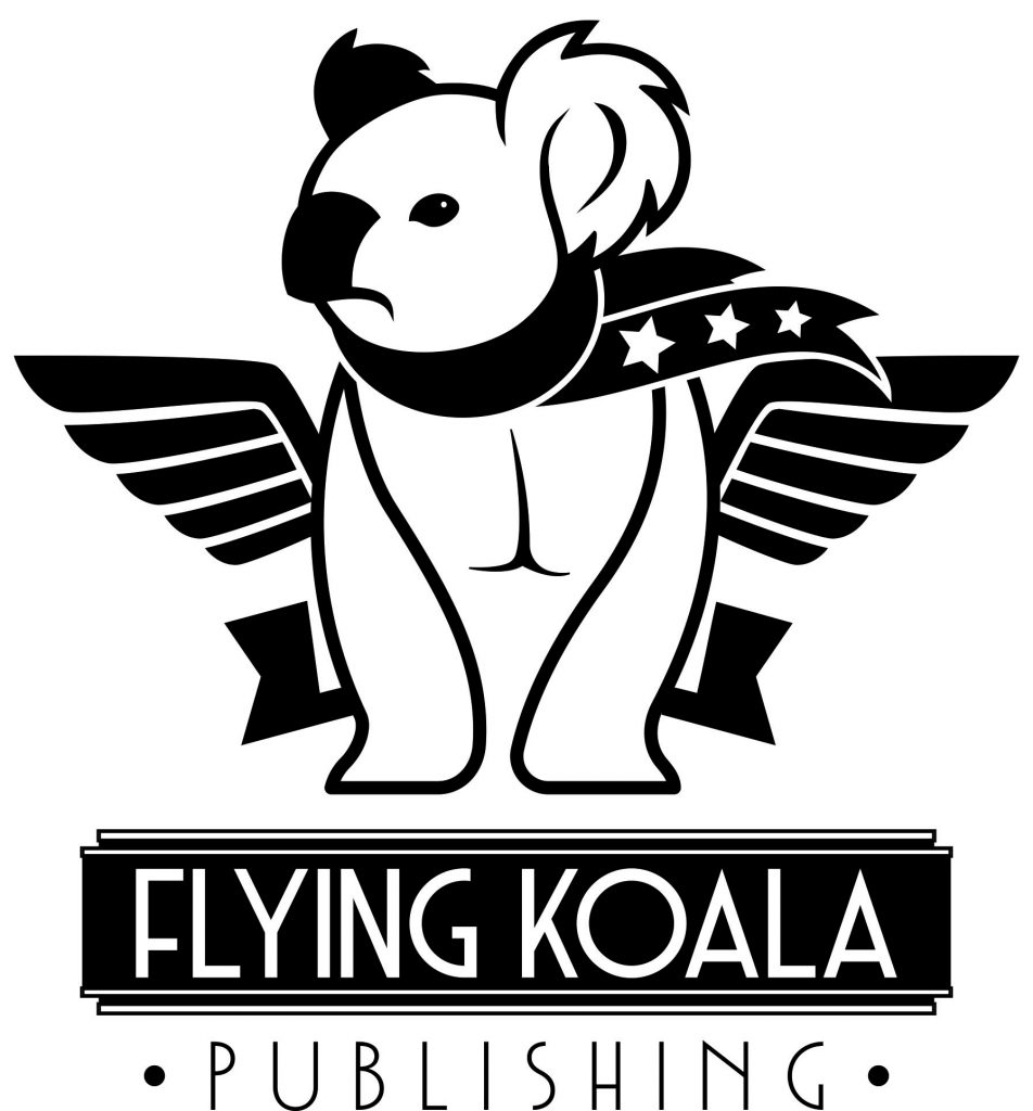
I have artwork that I can use, all of which I explicitly bought with the understanding that I could use it for advertising my books and my site. And it’s not too expensive to buy a hanging banner to attract the eye. The question is, which should I use?
I’m inclined to these three:


Vector image of an koala bear design on white background
All suitably cropped and positioned, of course. Does anybody have any thoughts on what might look best? I like the one in the middle, but I dunno if it’ll sell the most books.
#commissionearned

The Flying Koala logo is brilliant, and doesn’t directly preclude any of your currently published or hinted at future works.
That said.. it also doesn’t scream “steampunk”, or “cosmic horror”, or “post-apocalyptic urban fantasy”.
If you are in it for the long haul, get the koala on vinyl, and get friendly with the large format printer at your FedEx/Kinkos to print individual covers.
Just my $0.01 (inflation adjusted)
Mew
Koala catches the eye best, espically over a
Okay, seems to be a bit of a consensus on the koala.
Koala is identifiable and catches the eye over a distance – important on a convention floor.
Also, weirdly, the first two options didn’t display on my laptop until I was logged in to comment. Track down that little bit of gremlinry if you desire.
What they said.