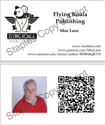
Is this too busy? It feels too busy. Opinions welcome.

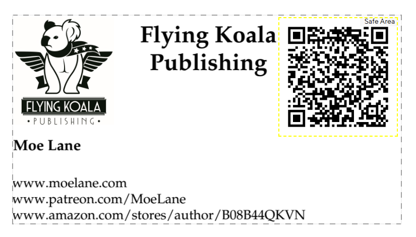
UPDATE: My wife suggests this, but with the photo rotated.


Is this too busy? It feels too busy. Opinions welcome.

UPDATE: My wife suggests this, but with the photo rotated.

Comments are closed.
I think the main webpage is the only full address you need. Then just one or two sites to search your name on. No one types in full Amazon page URLs.
Maybe put the Amazon URL on the back, at the bottom?
That would help with the visual space. The more the visuals take center stage at the top without distractions the better.
Not too busy, but not well balanced. There’s a big hole in the center of the card where there isn’t anything.
I think your wife’s suggestion leads to a better-balanced use of space. It’s also perfectly serviceable as a single-sided card (which is presumably less costly), so you can have both “deluxe” double-sided and “standard” single-sided edition cards, depending on the circumstances*.
* This assertion is predicated on the QR code thing not being mandatory. The last time I needed business cards was a couple of decades ago, when QR codes weren’t a thing.
A business card may seem to just need the links on them, but you also need to include an email or a phone number to get a hold of you. Sometimes the cards are the only things people hold onto for a while and they won’t want to go looking up the information for how to contact you. Make it easy for someone to reach out to you without having to go through a few steps to find your info. Think of it like a mini resume. What about you will catch their attention and how easy is it to contact you without having to dig for it or scan anything. I don’t scan QR codes because you just can’t trust everyone so don’t assume that everyone will be able to get to you by scanning it. Some more old school people will still need to contact you too you know…….
Ah, how do I put this… these aren’t ‘contact me’ business cards. These are ‘buy my books’ business cards. 😉
The QR code can maybe be smaller…. Cameras are better than eyeballs at pricking out fine detail.
Picture left, yours on the back, Koala on the front, without the text. Flying Koala Publishing along the bottom. Web site front and back, top right. Smaller QR to the right of the koala,
On the back, title (Writer, Storyteller, Fabulist, what do you tell yourself you do?) name, and websites.
Put it together and see how it feels.
Mew